

 Français
 Business dashboard: optimize your management
Boost your decision-making with our business dashboard and improve your performance. Try it today!

The power of the business dashboard decoded
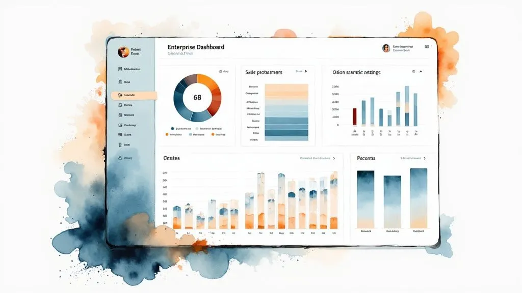
Do you sometimes feel overwhelmed by the flow of data in your business? A well-designed business dashboard can help you see things more clearly. More than a simple reporting tool, it becomes a genuine control center for your activity. It turns raw data into actionable information, simplifying strategic decision-making.
Beyond simple reporting
A high-performing dashboard doesn’t just display numbers. It synthesizes your company’s key data, highlighting important trends and performance. Take the example of a car’s dashboard: it tells you the speed, the fuel level, and other indicators essential for safe and efficient driving. A business dashboard works the same way: it gives you a real-time overview of your company’s health.
The importance of actionable data
Accumulating data without using it is pointless. Its true value lies in its ability to be turned into concrete actions. A good dashboard lets you quickly identify your company’s strengths and weaknesses. For example, a sudden drop in sales can be spotted and analyzed immediately, enabling a fast, appropriate response. This responsiveness is what makes the difference. In 2020, micro-enterprises accounted for 96% of French businesses, according to Insee, and the adoption of high-performing dashboards keeps growing, particularly in the Île-de-France region. Check the statistics on French micro-enterprises to learn more.
From raw data to strategic decisions
High-performing companies favor dynamic visualizations over static reports. This shift makes data easier to understand and improves communication between teams. An interactive dashboard lets you explore data in depth, filter information, and customize displays. It then becomes a central tool for strategic decision-making, helping you anticipate difficulties and seize opportunities.
The impact on performance
The main goal of a business dashboard is to improve overall performance. By providing a clear, precise view of your activity, it helps you manage your business better, optimize processes, and reach the objectives you’ve set. A well-designed dashboard is a major asset for your company’s growth and success.
The metrics that really make a difference
Not all key performance indicators (KPIs) are equal. Some are rich in insight, others just drown the analysis in a flood of useless data. Building a relevant business dashboard therefore relies on a rigorous selection of metrics. That’s the key to turning raw data into concrete, effective actions.
Identifying strategic metrics
To build an effective dashboard, you first need to identify the key questions it must answer. What is the main objective? Improve profitability? Boost sales? Increase customer satisfaction? Each objective requires specific indicators. For example, for sales tracking, revenue, conversion rate, and average order value are essential indicators.
To illustrate, take the example of a company wanting to improve its profitability. Indicators like gross margin or customer acquisition cost would then be particularly relevant.
The indicator pyramid
Picture a pyramid: at its base, the fundamental financial indicators (revenue, gross margin, etc.). At the level above, the operational indicators (production rate, delivery times, etc.). Finally, at the top, the strategic indicators, forward-looking and focused on emerging trends. A high-performing dashboard combines these three levels for a comprehensive, informed view of the business.
This pyramid model helps prioritize information and understand the cause-and-effect links between the different indicators.
For an in-depth analysis of your financial data, you can use tools like Bizyness.
Lagging indicators vs. leading indicators
Distinguishing lagging indicators from leading indicators is essential. The former, such as last quarter’s revenue, measure past performance. The latter, such as the number of qualified leads, help anticipate future performance. Lagging indicators validate past strategies, while leading indicators help adjust course and optimize upcoming actions. In Île-de-France, 62% of SMEs use monthly dashboards, often focusing on economic and human indicators, according to structural data on French SMEs. More information on SME statistics is available here.
This distinction is essential for managing your business effectively and making informed decisions.
The importance of visualization and adaptation
Presenting your indicators is just as important as selecting them. Clear charts, concise tables, and color codes make data easier to interpret. A well-visualized dashboard enables fast, relevant decision-making. Don’t forget to adapt your dashboard to your industry and your company’s size. The needs of a start-up differ from those of a large corporation. Focus on the metrics that truly impact your business and track them regularly.
Concrete examples of relevant indicators
Here are a few examples of relevant indicators, by industry:
- For e-commerce: cart abandonment rate, customer acquisition cost, product return rate.
- For marketing: return on investment (ROI) of campaigns, email open rate, web traffic.
- For human resources: absenteeism rate, staff turnover rate, employee satisfaction.
Before presenting the comparison table, it’s worth noting that key indicators vary depending on the type of business.
Here is a comparison table to illustrate these differences:
The indicators that move the needle, by company profile
| Company profile | Critical financial indicators | Commercial metrics to watch | Telling HR signals |
|---|---|---|---|
| Start-up (seed phase) | Burn rate, Runway | Number of users, Growth rate | Employee retention rate, Employee satisfaction |
| SME (growth) | Gross margin, Net profit | Conversion rate, Revenue per customer | Cost per hire, Team performance |
| Large corporation (mature) | Return on investment (ROI), Market share | Customer retention rate, Customer lifetime value | Internal promotion rate, Workplace climate |
This table highlights the importance of choosing indicators suited to each company’s situation. A start-up in its seed phase will focus on financial survival and acquiring new users, while a large corporation will prioritize profitability and customer loyalty. The choice of HR indicators is just as crucial, reflecting the challenges specific to each type of company, from talent retention for start-ups to managing workplace climate for large corporations.
Designing your custom dashboard
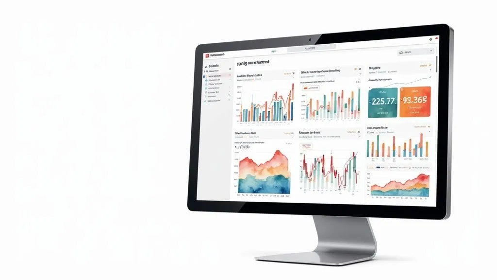
A standardized dashboard doesn’t always meet your company’s specific needs. For effective management, it’s essential to design a custom business dashboard. This process, far from being complex, relies on a simple, accessible methodology.
Identifying the strategic questions
The first step is to identify the key questions your dashboard must answer. It’s a bit like using a GPS: before mapping the route, you need to set the destination. For your business, this means clearly defining your objectives. Do you want to increase your market share? Improve customer satisfaction? Optimize your production? These objectives will guide the choice of indicators.
Mapping decision-making flows
High-performing companies map their decision-making flows before choosing their indicators. The goal is to make sure every piece of data displayed contributes to decision-making. For example, to improve an e-commerce site’s conversion rate, the dashboard could display the cart abandonment rate, the time spent on each page, and the traffic sources.
Usability and clarity: understandable data
An effective dashboard must be intuitive and easy to interpret. Clear, relevant visualizations turn complex data into actionable information. Imagine an aircraft dashboard with a multitude of incomprehensible lights: the pilot would be lost. Likewise, an overloaded or poorly designed business dashboard can hinder decision-making. Using charts, color codes, and a clean layout is essential.
Personalization by user profile: maximizing impact
Adapting the dashboard to each user profile maximizes its impact. A marketing director doesn’t have the same needs as a production manager. By personalizing data access, each employee gets the information relevant to their role, optimizing their time and efficiency. A personalized dashboard becomes a genuine decision-support tool, regardless of hierarchical level. A salesperson can check their performance indicators, while a logistics manager tracks delivery times and transport costs.
Examples of success and failure
A dashboard showing only revenue, without comparing it to objectives or past performance, is an example of failure. Conversely, a dashboard presenting key indicators, threshold alerts, and action recommendations is an example of success. Analyzing these examples helps identify best practices and avoid pitfalls. A good dashboard must be scalable and adaptable to changes within the company. Using a solution like Bizyness makes it easy to build high-performing, personalized dashboards, integrating data from various sources. More information on the Bizyness website.
Technology and tools: beyond the hype
Choosing the right technology for your business dashboard is an essential step. The tool must integrate with your processes and meet your specific needs. The options range widely, from simple solutions like Excel to more complex Business Intelligence platforms like Tableau or Power BI. This guide will help you understand the pros and cons of each option.
The myth of the perfect solution
Investing heavily in a sophisticated solution does not guarantee success. Some companies thrive with simple tools, while others struggle to make full use of complex platforms. Technology is just a tool; the effectiveness of a dashboard rests on the relevance of its indicators and the clarity of their presentation. A well-designed Excel dashboard can outperform an underused BI solution. Take the example of a small business investing in a costly solution when a spreadsheet would suffice. That budget could be allocated to other, more relevant projects.
The pillars of a high-performing dashboard
Beyond technology, three elements are essential: integration with your current systems, automated data collection, and mobile access. A dashboard disconnected from your data loses all its usefulness. Automation simplifies updates and reduces errors. Mobile access, for its part, lets you track your key indicators wherever you are.
Total cost of ownership: an essential factor
A software’s purchase price only represents part of the real cost. You also need to factor in implementation, team training, maintenance, and updates. This is what’s known as the total cost of ownership. A solution that’s initially inexpensive can turn out to be more costly in the long run.
Anticipating future needs
Your business evolves, and your dashboard must keep pace. Choose a flexible, scalable solution that will adapt as your business grows. A tool that’s too simple risks becoming obsolete quickly, while a solution that’s too complex can be hard to adapt to your specific needs.
Comparing solutions
To help you choose, here is a comparison table of different solutions:
Dashboard solutions: beyond the marketing
An objective comparative analysis of the leading technologies available for your business dashboard
| Solution | Ideal profile | Real investment | Learning curve | Connectivity | Distinctive advantages |
|---|---|---|---|---|---|
| Excel | Micro-businesses, Sole traders | Low | Easy | Limited | Simplicity, Accessibility |
| Google Sheets | Small businesses, Collaborative | Low | Easy | Good (Cloud) | Easy sharing, Collaborative work |
| Power BI | SMEs, Corporate departments | Medium | Moderate | Very good | Advanced visualizations, Integration with the Microsoft ecosystem |
| Tableau | Large corporations, Complex data analysis | High | Difficult | Excellent | Performance, Advanced features |
| Bizyness | Micro-businesses, SMEs, Independents | Affordable | Easy | Excellent | Simplicity, Automated bookkeeping, E-commerce integrations |
This table highlights the variety of solutions available. Bizyness, for example, stands out for its simplicity, accessibility, and integrations for online sellers. To learn more, visit the Bizyness website. The choice of the right tool depends on your needs, resources, and objectives.
Industry-specific dashboards: the details that change everything
A business dashboard is not a one-size-fits-all solution. Its effectiveness depends on its ability to reflect the realities specific to each industry. What matters most for an e-commerce business isn’t necessarily what matters for an industrial company. Adapting your dashboard to your industry is therefore essential for relevant, effective management.
Retail: the customer experience at the heart of the dashboard
In retail, integrating customer journey metrics is fundamental. Beyond traditional financial indicators, successful companies closely monitor data such as the conversion rate, average order value, cart abandonment rate, and retention rate.
These indicators help analyze customer behavior and optimize the shopping experience. For example, a high cart abandonment rate may indicate a usability issue on the website or shipping costs that are too high.
Manufacturing: quality, maintenance, and customer satisfaction
In manufacturing, the dashboard needs to include indicators for quality, predictive maintenance, and customer satisfaction. Correlating this data helps anticipate breakdowns, optimize production, and improve product quality.
A dashboard cross-referencing the manufacturing defect rate with predictive maintenance data can, for example, help pinpoint the root cause of problems and implement corrective actions.
B2B services: measuring customer engagement
For B2B services, it’s important to go beyond simple satisfaction and measure engagement. Indicators such as Net Promoter Score (NPS), Customer Effort Score (CES), or retention rate help assess customer loyalty and identify areas for improvement.
A low NPS may, for example, reveal a need to strengthen customer relationships or improve the quality of the services offered.
Industry examples: tech, healthcare, and retail distribution
Every industry has its own key indicators. In tech, the number of active users, the churn rate, and the customer acquisition cost are essential. In healthcare, companies tend to track bed occupancy rate, emergency room wait times, and readmission rate.
Finally, in distribution, inventory turnover, store performance, and customer satisfaction are key indicators. The economic dashboard for the Île-de-France region, published by the CCI Paris Île-de-France, offers an overview of key trends for businesses in the region. It includes data on business creations and failures, as well as the unemployment rate.
Anticipating market changes
Leading companies use their dashboards to anticipate changes in their competitive environment. By identifying relevant predictive indicators, they can adapt their strategy and make informed decisions.
Bizyness, thanks to its simplicity and integrations, makes it easy to build dashboards tailored to each industry. For more information, visit the Bizyness website. Analyzing industry-specific data and using a high-performing dashboard are significant assets for your company’s success.
Turning insights into concrete actions
A business dashboard that doesn’t influence decisions is just a decorative tool. Its true value lies in its ability to turn raw data into concrete, effective actions. This section explores how to make full use of your dashboard to steer your business and reach your strategic objectives.
Decision-making rituals optimized through the dashboard
Agile, responsive companies systematically integrate their dashboard into their decision-making rituals. From 15-minute daily team meetings to quarterly strategic reviews, the dashboard becomes the reference point for performance analysis and informed decision-making. For example, during a daily meeting, the team can quickly identify production bottlenecks by checking key indicators and put immediate solutions in place. Quarterly reviews, meanwhile, allow for analyzing underlying trends and adapting long-term strategy.
Setting alert thresholds for better responsiveness
To avoid being overwhelmed by data analysis, it’s essential to set alert thresholds. Determined based on your objectives and performance indicators, these thresholds trigger specific actions. If your e-commerce site’s conversion rate drops below a certain threshold, an alert can be automatically sent to the marketing team. They can then identify the causes of the drop and implement corrective actions. This system allows you to respond quickly to significant fluctuations and anticipate potential problems.
Structuring concrete, measurable action plans
A high-performing dashboard doesn’t just display data: it structures action plans directly tied to key indicators. Each action must be clearly defined, with measurable objectives and designated owners. If your goal is to increase your customers’ average order value, you could implement actions like suggesting complementary products or optimizing shipping costs. The dashboard will then let you assess the impact of these actions on your average order value and adjust your approach as needed.
The dashboard: a tool for communication and cohesion
High-performing companies use their dashboard as an internal communication and strategic alignment tool. Sharing key data with all employees fosters transparency and collaboration. The dashboard then becomes a way to turn data into clear, motivating information. Everyone understands the stakes and can contribute to achieving shared objectives. Imagine a dashboard showing sales progress in real time: it motivates sales teams and encourages them to push further.
Examples of successful transformation
Many companies have significantly improved their responsiveness thanks to a high-performing dashboard. A logistics company, for example, optimized its delivery times by tracking its carriers’ performance indicators in real time. Another improved its profitability by identifying and correcting sources of waste through precise tracking of its production costs. These concrete examples illustrate the positive impact of a well-designed dashboard on companies’ overall performance.
Bizyness lets you easily create a personalized dashboard, tailored to your needs and your industry. Simplify your management and make informed decisions with a clear view of your data. Discover Bizyness’s features and optimize your management: Bizyness
