

 Français
Building a High-Performing Management Dashboard
Learn how to build a management dashboard that turns your data into strategic decisions. A practical guide to choosing the right KPIs and tools.

Picture an airplane cockpit for a moment. The pilot has dozens of indicators in front of them, giving a perfect, real-time view of the situation. That’s exactly what a management dashboard does for your business: it centralizes your key data and turns it into a strategic control panel.
It’s your compass. The tool that turns a mountain of raw numbers into clear, fast, and above all, well-informed decisions.
Why your management depends on a good dashboard
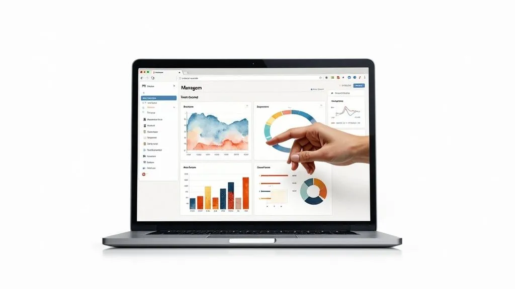
Running a business without an effective dashboard is a bit like sailing blind through a storm. Plenty of people do it, but at what cost? This tool isn’t just a report full of numbers; it’s the very heart of your engine. It lets you move from “firefighter” management — often stressful and costly — to a proactive, far calmer approach.
Instead of chasing problems once they’ve already snowballed, a well-designed dashboard helps you sniff out trends, anticipate turns, and even spot opportunities no one else sees. It’s also a powerful way to align all your teams around clear, shared goals.
Moving from reactive to proactive
The real magic of a dashboard is its ability to transform the way you think.
Take a concrete example: your sales start to slip. Without rigorous tracking, you might not notice until the end of the month, when it’s already too late to correct course. With a real-time dashboard, the dip is visible after just a few days. You can then immediately dig in: is an ad campaign underperforming? Is there a bug on your website? Has a competitor launched an aggressive promotion?
This near-instant ability to react is a huge competitive advantage. You stop being at the mercy of events and start steering them.
A good dashboard doesn’t just give answers. Above all, it helps ask the right questions at the right time. That’s where its true strategic value lies.
In France, this tool has become essential, particularly for SMEs. It’s estimated that nearly 70% of French SMEs rely on a dashboard to track their indicators, led by revenue, margin, and sales costs. In 2021, 65% of them said the practice had markedly improved their decision-making. Better still, these tools reduce budget variances by an average of 15% to 20% in a single year. For more on this, Bpifrance’s insights on business management tools are well worth a read.
The pillars of a dashboard that actually works
To be truly useful, your dashboard shouldn’t be limited to financial figures. It needs to reflect your company’s overall health, resting on several fundamental pillars.
- Financial and economic indicators: The foundation, the non-negotiable basics. Revenue, profitability, cash flow, cost structure… you need to keep an eye on all of it.
- Sales and marketing indicators: What’s your customer acquisition cost? Your conversion rate? Your customer lifetime value (LTV)? These metrics measure the performance of your growth engine.
- Operational indicators: From production quality to delivery times, and customer satisfaction (CSAT or NPS), they assess the efficiency of your “engine room.”
- Human indicators: Never overlook these. Turnover rate, team engagement, and individual performance are crucial signals for the future.
It’s by combining these different perspectives that your dashboard becomes a faithful, complete representation of your business. This balance is what turns a simple report full of numbers into a powerful strategic management tool.
Choosing the right performance indicators (KPIs)
To be effective, a management dashboard needs to be crystal clear. Overloaded, it becomes just as useless as an empty one. Its true value doesn’t come from the number of indicators you put in it, but from their relevance. The key is an almost surgical selection of your key performance indicators (KPIs).
The classic trap? Getting dazzled by “vanity metrics.” These are the numbers that feel good to look at, like the number of likes on a post or visits to your website. They’re flattering, sure, but they tell you absolutely nothing about the real health of your business.
To build a dashboard that will actually serve you, you need to learn to separate what shines from what counts.
Telling result indicators apart from predictive indicators
Your dashboard needs to tell a complete story: your past, your present, and above all, what’s on the horizon. To achieve that, you need a proper balance between two types of indicators.
- Result indicators (or Lagging Indicators): They look backward and measure past performance. Think of last month’s revenue, your gross margin, or net profit. They’re essential for validating whether your strategy paid off, but the finding often arrives too late to correct course.
- Predictive indicators (or Leading Indicators): These are your turn signals, your early warning signs. They measure actions that have a direct impact on your future results. The number of product demos your sales team has scheduled for next week, for example, or the volume of qualified leads generated by your latest campaign. These figures give you a head start to act before it’s too late.
A dashboard that only contains result indicators is like driving while staring at the rearview mirror. You know perfectly well where you came from, but you’re heading straight into the fog. Balance is truly fundamental here.
Linking every KPI to a strategic objective
A KPI that isn’t tied to a clear business objective is just a number on a screen. It’s noise. Tracking data for the sake of tracking it is a massive waste of time. Before deciding to add an indicator, get into the habit of asking this simple question: “What concrete decision will this data help me make?”. If the answer isn’t immediate, the indicator probably doesn’t belong there.
Let’s take a concrete example. Your goal is to improve the company’s overall profitability. Here’s how that objective breaks down into relevant KPIs for each department:
- Sales team: Instead of counting the number of calls made, we’ll track the average sales cycle instead. Shorten it, and the impact on cash flow and costs is direct.
- Marketing team: Forget the number of social media followers. The indicator that really counts is the cost per qualified lead (CPL). Controlling it means optimizing budget and maximizing return on investment.
- Operations team: The number of packages shipped is a vanity metric. What you actually want to know is the customer satisfaction rate (CSAT) after delivery. This indicator directly influences loyalty, and therefore long-term profitability.
- Finance department: Revenue matters, of course. But precise tracking of margin per product or per service gives far more valuable information for adjusting your offering strategy.
In this process, don’t forget the purely accounting data that feeds all of these indicators. To dig deeper into this topic, our guide on the accounting dashboard is an excellent resource for structuring that part of your tracking.
Aim for simplicity: the 5-to-7-KPI rule
The temptation to measure everything is strong. Resist it. A good dashboard should be readable and understandable at a glance. Conciseness is your best ally.
A method that has proven itself is limiting yourself to 5 to 7 key indicators per major strategic objective or per department. This constraint is very healthy: it forces you to make choices, debate internally, and focus on what actually has an impact.
Each KPI should tell a chapter of your performance story. Together, they form a coherent, actionable narrative. It’s only by being this selective that your dashboard will stop being a simple report and become a true cockpit for steering your entire business.
Choosing the right tool to build your dashboard
Your key performance indicators are now defined and ready to use. The question that arises, and it’s a crucial one, is which tool to choose to bring them to life and build your management dashboard. This is really not a technical detail, because your choice will directly influence the flexibility, efficiency, and scalability of your management.
The market is flooded with reporting tools. To make sense of it, you first need to distinguish two major families: the spreadsheets everyone knows and specialized Business Intelligence (BI) platforms. Each has its own advantages and meets very different needs, skill levels, and budgets.
To get started: spreadsheets like Excel or Google Sheets
For many businesses, especially freelancers and small structures, the natural instinct is to turn to spreadsheets like Excel or Google Sheets. Their main advantage? They’re already there. Most of the time, they’re already installed on our computers or accessible for free, and honestly, who doesn’t know at least the basics?
It’s an excellent solution for building a first draft, testing the relevance of your KPIs, and putting together a first version of your dashboard without spending a cent. You can easily organize your data, create a few simple charts, and get a feel for reporting logic.
The problem is that this simplicity has its limits, and you often hit them faster than you’d think. Manual updates become a real nightmare, a considerable waste of time and, above all, a major source of errors. One broken formula, one unfortunate copy-paste, and your entire dashboard becomes inaccurate. Not to mention collaboration, which can quickly turn into a nightmare with Excel files exchanged by email.
To move up a gear: Business Intelligence tools
When manual updates take more time than the analysis itself, and the risk of error keeps you up at night, it’s time to look at BI platforms. Tools like Power BI, Tableau, or all-in-one solutions like Bizyness, were built for exactly this: visualizing data.
Their strength is automation. They connect directly to your data sources (CRM, ERP, invoicing software, etc.). No more manual exports! Your figures update automatically, guaranteeing you an always-fresh, always-accurate view of the situation.
These platforms also let you create far more dynamic and interactive visuals. You can filter, zoom, and cross-reference data in a few clicks. You move from simple observation to genuine exploration, which is far more powerful. For a more concrete idea, take a look at our example financial dashboard. It’s a great source of inspiration.
A high-performing dashboard shouldn’t be a static photo, but rather an interactive film. BI tools turn your raw data into a story you can explore to unearth hidden gems.
This image nicely sums up the key elements of a well-designed dashboard.
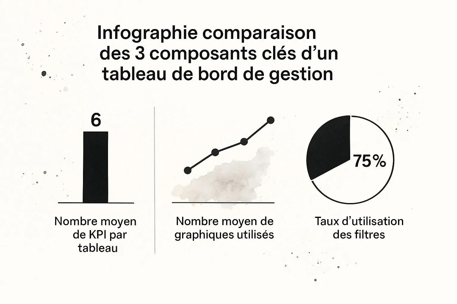
You can see that simplicity (an average of 6 KPIs) and interactivity (a 75% usage rate for filters) are truly at the heart of a successful design.
Comparison table to help you choose
To help you weigh the pros and cons, here’s a table summarizing the major options. It compares the main types of tools for building a dashboard based on their complexity, cost, and audience.
Comparison of tools for building a management dashboard
| Tool type | Ideal for | Key advantages | Major drawbacks | Examples |
|---|---|---|---|---|
| Spreadsheets | Freelancers, micro-businesses, prototyping | Easy to use, low cost (often free) | Manual updates, risk of errors, limited collaboration | Excel, Google Sheets |
| BI software | Growing SMEs and mid-sized companies | Automation, interactive visualizations, scalability | Learning curve, higher cost | Power BI, Tableau, Looker Studio |
| Integrated solutions | Entrepreneurs and SMEs seeking simplicity | Quick to get started, all-in-one (invoicing + reporting), designed for non-specialists | Less customization than expert BI tools | Bizyness |
This table is a good starting point, but the final choice will really depend on your unique context.
Criteria for making the right choice
Between a spreadsheet and a BI tool, or even between two BI platforms, the decision should rest on a few key questions specific to your business.
- Learning curve: Do you have the in-house resources to train on a powerful but complex tool like Tableau? Or would a “plug and play” solution be a better fit?
- Scalability: Is your data volume going to explode in the coming months? The tool needs to be able to keep up with your growth without lagging.
- Integrations: Can the tool easily connect to your everyday software? Think about your CRM, your invoicing tool, your e-commerce platforms. This is a non-negotiable point.
- Customization: How much visual freedom do you need? Some tools are genuine creative toolboxes, others are more guided.
- Cost: Look closely at the business model. Is it a monthly subscription, an annual license, a per-user cost? Make sure it fits your budget.
Really take the time to weigh these criteria. Remember that the best tool isn’t necessarily the most powerful or the most expensive. It’s the one that fits most naturally into your daily routine and supports your ambitions.
Design principles for a readable dashboard

A good management dashboard should be readable at a glance. If you have to squint for more than ten seconds to understand the essentials, there’s a design problem. This isn’t about making things “pretty”; it’s about making information instantly digestible. The goal is simple: turn an avalanche of data into a clear story that makes you want to act.
Don’t think of design as the icing on the cake. It’s the very foundation that ensures your carefully chosen indicators are interpreted correctly. Sloppy design doesn’t just make your tool useless; it can actually push you toward bad decisions.
Choosing the right chart for the right data
Data visualization is a bit like a language. Each type of chart has its own grammar. Using the wrong visual is like making a huge grammatical mistake: no one understands the message.
To avoid falling into this trap, keep a few golden rules in mind that work in most cases.
- To compare categories: Nothing beats bar charts. They’re perfect for weighing distinct values against each other, like revenue by product or number of leads by acquisition channel. The human eye is incredibly good at comparing the length of bars.
- To track change over time: Line charts are your best allies. They’re ideal for visualizing a trend over several weeks, months, or years. Think of website traffic tracking or your cash flow evolution.
- To show the composition of a whole: The pie chart is often tempting, but be careful. It’s really only effective with very few categories, say 2 or 3 maximum. Beyond that, it quickly becomes an illegible puzzle.
- To identify correlations or concentrations: Heatmaps or scatter plots are fantastic for revealing complex links between two variables or spotting areas of high intensity.
Choosing the right chart is the first step toward telling a story that makes sense. It’s what turns raw numbers into concepts you grasp instantly.
Organizing the space to guide the eye
Have you ever wondered how people read a screen? Generally, our eyes scan the page following an “F” or “Z” pattern. We start top-left, sweep the first line, then move down along the left edge.
This reading habit has a huge impact on how you should structure your dashboard.
Always place the most critical piece of information, your company’s number-one KPI, in the top left. It’s the front page of your internal newspaper, the first thing everyone will see.
From that anchor point, everything else should flow naturally. Group related indicators together. For example, put marketing KPIs on one side and financial KPIs on the other. Also play with chart size to create hierarchy: a larger visual will naturally capture more attention.
Simplicity, always simplicity
The worst enemy of an effective dashboard? Visual noise. Garish colors, unnecessary borders, overly present gridlines, redundant legends… anything that distracts from the essential: the data itself.
A good habit to adopt is subtraction. Once your chart is finished, ask yourself this question: “What can I remove without losing the meaning of the information?” You’d be surprised how much is superfluous.
Here are a few practical tips:
- Limit your color palette: Stick to one or two main colors and shades of gray. Reserve a bright color (a red, an orange) exclusively for signaling an alert, like a missed target.
- Streamline your charts: Remove background gridlines or fade them as much as possible. When possible, integrate legends directly into the charts.
- Let your visuals breathe: White space isn’t wasted space, quite the opposite. It helps separate elements, create logical groups, and make the whole thing less overwhelming.
By following these principles, you won’t just be making a “prettier” dashboard. You’ll be building a genuine communication tool, capable of turning your data into a visual story that guides your teams toward the right decisions.
Integrating your dashboard into daily management

Having a perfectly designed management dashboard is great. But making sure it doesn’t gather digital dust is even better. Let’s be clear: a tool, however powerful, only creates value if it’s at the heart of your decisions. True success means embedding it lastingly into your company’s culture.
The goal? For checking it to become a reflex, a real travel companion for you and your teams. Above all, it shouldn’t be seen as a surveillance tool, but rather as the starting point for constructive discussions that move projects forward.
Creating rituals around the data
For a dashboard to come alive, it needs to be anchored in habits, in regular rituals. The simplest and most effective is the performance review, whether weekly or monthly. That’s the precise moment when numbers turn into strategic dialogue.
Picture your Monday morning team meeting. Instead of starting with a subjective round-table where everyone shares their gut feeling, project the dashboard. The nature of the conversation immediately changes. You no longer ask “What are the numbers?” but rather “What are these numbers telling us and, above all, what do we decide to do this week to improve them?”
This simple shift in perspective transforms the group dynamic. The dashboard becomes a single source of truth, aligning everyone on the same observations and the same priorities. It’s an incredibly effective way to build a culture of transparency and accountability.
The ultimate goal isn’t to look at the numbers, but to make them talk. A good dashboard should start a discussion, not end it. Every indicator should lead to a question, and every question to a potential action.
Turning your dashboard into a living organism
Your business evolves, your market changes, your strategy sharpens. Your dashboard needs to keep pace. One of the most common mistakes is to treat it as a project with an end date. In reality, it’s a living organism that needs to grow and adapt alongside you.
To achieve that, put in place a simple, continuous feedback process.
- Survey users: Regularly ask your teams whether the indicators they track are still relevant. Does this data actually help them make better decisions day to day?
- Schedule periodic reviews: Step back, for example every quarter. Analyze the relevance of each KPI. Some may have become useless, while new needs may have emerged.
- Don’t be afraid to “kill” KPIs: Removing an indicator is just as important as adding one. An overloaded dashboard loses all its effectiveness. If a KPI no longer triggers action or decisions, it’s time to say goodbye.
This agile approach ensures your tool stays perfectly aligned with your current objectives. To go further, our guide on the business dashboard will give you concrete ideas for building and evolving your own tool.
Going beyond financial figures
Fortunately, the vision of the management dashboard has evolved a great deal. It used to often boil down to somewhat austere accounting reports. Today, a modern tool embraces a much broader vision of performance.
This evolution was marked in France as early as the 1990s by the adoption of the Balanced Scorecard concept. This approach, developed by Kaplan and Norton, popularized the idea that you can’t manage a business based on finances alone. It integrates equally crucial non-financial dimensions: customer satisfaction, process efficiency, or skills development.
In concrete terms, this means your dashboard needs to reflect the more human and qualitative facets of your business.
- Customer axis: How is your customer satisfaction (NPS, CSAT) evolving? What’s your retention rate?
- Internal processes axis: Are your delivery times improving? Is support ticket resolution time decreasing?
- Learning and growth axis: Are your teams building new skills? What’s your employee engagement rate?
By integrating these different dimensions, your management dashboard becomes a much more faithful and balanced reflection of your business’s real health. It helps you manage not just your short-term results, but also the levers that will build tomorrow’s performance.
Frequently asked questions about the management dashboard
Even with the best of intentions, launching into building a management dashboard always raises a batch of very concrete questions. That’s perfectly normal. So let’s answer, straightforwardly, the questions that come up most often among managers and executives.
The goal is simple: to give you clear reference points to move from theory to action without the slightest hesitation.
How many indicators should you really track?
The temptation to measure everything is strong. Yet it’s the surest way to end up with an overloaded, illegible tool that never actually gets used. The golden rule is simple: less is more. An effective dashboard is a concise dashboard.
For the company-wide view, the one that interests management, aim for between 5 and 9 key performance indicators (KPIs). No more. That number may seem low, but this constraint forces you to focus on what has a real impact on your strategy.
Each department or team can then have its own dashboard, a bit more detailed, with 5 to 7 KPIs specific to their missions. The idea isn’t to monitor everything, but to track metrics that trigger action and directly reflect objectives.
How often should you update and check the dashboard?
The right frequency depends entirely on the nature of your indicators. Not all KPIs live at the same pace, and trying to synchronize everything in real time is often a false good idea.
Let’s take a closer look:
- Operational indicators: These take the pulse of your day-to-day activity. Think daily sales, website traffic, or the number of new support tickets. For these, a daily update is ideal, or even real-time if your tool allows it.
- Strategic indicators: They measure your company’s health over the medium and long term: profitability, market share, customer satisfaction (the famous NPS)… A weekly or monthly analysis is far more relevant and sufficient.
What matters isn’t so much the frequency as the regularity. The real secret is anchoring dashboard review into a routine. The Monday morning team meeting, for example. That’s how it goes from “gadget” status to a genuine management tool.
Can you start with Excel before investing in a more powerful tool?
Yes, absolutely. It’s even an approach I strongly recommend. Starting out with a spreadsheet like Excel or Google Sheets is an excellent way to get your foot in the door without incurring significant costs. It’s a learning phase that’s priceless.
This first step forces you to clarify your thinking, validate the relevance of your KPIs, and create a first version of your management dashboard. You get to grips with the tool’s logic before getting lost in the sometimes complex features of specialized software.
When will you know it’s time to move up a gear, toward a Business Intelligence (BI) solution? Watch for these signals:
- Manual updates take a huge amount of time and become a real chore.
- The risk of human error (a formula slipping, a bad copy-paste) becomes too critical.
- You feel the need for more interactive charts and simple, secure sharing with your teams.
How do you get teams to actually use the dashboard?
This is the question worth its weight in gold. A dashboard, however brilliant it looks on paper, is useless if it’s not adopted by the people it’s meant for. And adoption can’t be decreed, it has to be built.
Everything rests on two pillars: involvement and relevance.
The method is actually quite simple. First, involve your teams from the start in choosing the KPIs that concern them. An indicator you helped choose is one you naturally take ownership of.
Next, make sure every KPI is directly connected to an objective they have the power to act on. No one likes being evaluated on numbers they can’t influence.
Finally, and this is the crucial point, make your dashboard the unavoidable starting point of your performance meetings. If it’s THE source of truth for discussing results, analyzing variances, and deciding on next actions, using it will become as natural as checking your email.
By making this tool a support for dialogue, you ensure its lasting adoption in the company’s day-to-day life.
Radically simplify your management and create clear dashboards effortlessly. With Bizyness, invoicing, cash flow tracking, and reporting become child’s play, leaving you more time for what really matters: growing your business.
Discover how Bizyness can transform your daily routine starting today.
