

 Français
Accounting dashboard: your complete guide
Master your accounting dashboard with proven strategies. Discover how to turn your data into winning decisions.
Why your business needs an accounting dashboard
Juggling multiple financial reports and getting lost in a sea of numbers? An accounting dashboard offers a solution. It turns this complex flow of information into a clear, concise overview of your company’s financial health. It’s not simply a compilation of data — it’s an essential steering tool that lets you spot trends, opportunities and potential risks.
Making informed decisions with a synthesized view
Imagine a pilot flying without instruments. Unthinkable, right? The same holds true for a business leader. An accounting dashboard gives you the key information to navigate effectively. It lets you monitor your key performance indicators (KPIs) — revenue, margins, cash flow — at a glance. This simplifies strategic decision-making and lets you anticipate difficulties before they become critical.
Identifying growth levers and optimizing profitability
A well-structured dashboard lets you go beyond raw numbers. It helps you understand what drives your performance. For example, you can analyze how your costs evolve relative to revenue to spot areas for improvement. You can also track sales by product or by customer to fine-tune your commercial strategy. In France, the accounting dashboard is a central tool for monitoring business economic health and synthesizing national economic data. According to INSEE, the input-output table (TES) is an essential accounting tool for economic analysis. See more detailed statistics here.

Anticipating risks and ensuring your company’s longevity
Risk management is a key success factor. An accounting dashboard lets you spot early warning signs of potential financial trouble. Regularly tracking your debt ratio or your working capital requirement, for example, lets you anticipate cash-flow issues and act accordingly. Solid command of professional French can also be an asset for interpreting your data effectively. Discover how to improve your professional French.
Saving time and improving operational efficiency
Manually compiling and analyzing financial data is tedious and error-prone. An accounting dashboard automates this process and saves you precious time. You can then focus on higher-value activities, such as business development or customer relations. With a clear, synthesized view of your finances, you gain operational efficiency and optimize the management of your business. A well-designed dashboard also makes it easier to communicate with your financial partners and investors, letting you clearly present your performance and justify your strategic choices.
The indicators that really make the difference
Forget overloaded accounting dashboards. Effectiveness lies in simplicity and the relevance of your key performance indicators (KPIs). How do you identify the KPIs that truly matter for your business — the ones that will help you make informed decisions and optimize your performance?
The essential KPIs for a clear view
Certain key financial indicators reveal the health of your business. The liquidity ratio, for example, shows your ability to meet short-term obligations. A ratio below 1 can signal a cash-flow risk. The inventory conversion cycle measures how long it takes to turn stock into sales. The shorter this cycle, the better your performance.
Gross margin and net margin let you assess the profitability of your operations. Tracking these margins by business segment helps identify the most profitable products or services and optimize your strategy. The debt ratio measures the weight of your liabilities relative to your assets. A high ratio can weaken your financial structure.
Adapting indicators to your context
There is no universal dashboard. The relevant indicators vary depending on your industry and stage of development. A startup will favor indicators like revenue growth rate or customer acquisition cost. An established SME will focus on profitability and risk management.
An e-commerce business will place importance on conversion rate and average order value. An industrial company will track overall equipment effectiveness and manufacturing defect rate. The infographic below illustrates the compared evolution of monthly revenue, gross margin, and operating costs.
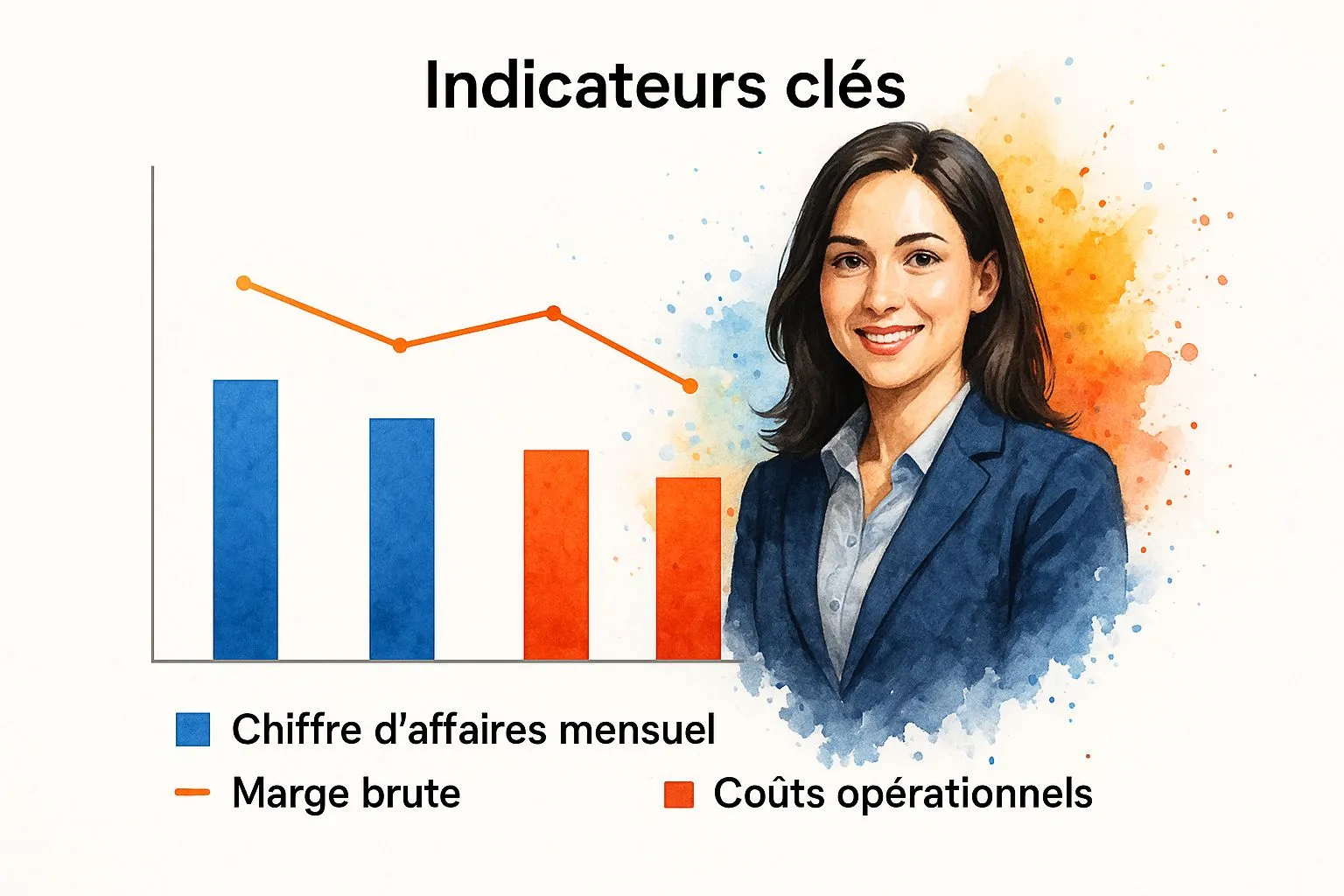
The infographic shows a correlation between rising revenue and increasing operating costs, while gross margin remains stable. This suggests good cost control despite growth.
To better understand the key indicators to track, here is a comparison table:
Key indicators by business type
Comparison of essential accounting KPIs by company size and sector
| Business type | Priority indicators | Tracking frequency | Alert thresholds |
|---|---|---|---|
| Startup | Revenue growth rate, Customer acquisition cost | Monthly | Growth below forecast, Acquisition cost too high |
| SME | Profitability, Net margin, Debt ratio | Quarterly | Declining profitability, Rising debt ratio |
| E-commerce | Conversion rate, Average order value | Weekly | Falling conversion rate, Decreasing average order value |
| Industry | Overall equipment effectiveness, Manufacturing defect rate | Daily/Weekly | Falling output, Rising defects |
This table summarizes the key indicators to prioritize by business type. It’s important to adapt the tracking frequency and alert thresholds to your own context.
Real-world examples for inspiration
Some companies have transformed their results by optimizing their dashboards. A company tracking its inventory conversion cycle identified inefficiencies in its supply chain management. By optimizing its logistics, it reduced its inventory by 20% and improved its cash flow.
Another company, through analyzing its margins by segment, discovered that a popular product was generating losses. By adjusting its price, the company turned it into a profit driver. These examples illustrate the importance of choosing the right indicators and analyzing them rigorously.
Spotting early signals and anticipating trends
A high-performing dashboard anticipates the future. By analyzing how your indicators evolve, you can identify early warning signals. A drop in conversion rate can indicate a web usability problem or increased competition. A rise in the customer complaint rate can signal a quality defect. By reacting quickly, you can anticipate problems and adjust your strategy. A well-designed dashboard is a powerful tool for steering your business.
Building your dashboard without losing your mind
Creating an effective accounting dashboard can seem daunting. Between scattered data, sometimes incompatible software, and evolving business needs, it’s easy to feel overwhelmed. However, taking a methodical approach makes the process much simpler. The first step is to precisely identify your needs. Ask yourself the right questions: what do you want to analyze? Which indicators are essential for tracking your business? Clarifying your goals from the outset will help you avoid getting sidetracked by unnecessary features.
Mapping your data sources
Once you’ve defined your needs, it’s essential to map your data sources. Where does your financial information come from? Your accounting software? Excel files? Other platforms? This inventory is essential for centralizing information and eliminating duplicates. Imagine building a house: you must know where the materials are before starting construction. Similarly, a dashboard’s performance relies on a clear, precise organization of data. To dig deeper into this topic, read this article: How to master your business dashboard.
Intelligently automating your information flows
Automation is a key element of an effective dashboard. There are tools that can automatically connect your various data sources to your dashboard. This saves you precious time and avoids errors linked to manual entry. Picture an automatic watering system: it irrigates your plants without any intervention on your part. Similarly, an automated information flow feeds your dashboard in real time, with no extra effort. The history of accounting dashboards in France is rich with lessons. For example, as early as the 1960s, institutions such as the Direction de la Prévision and the Banque de France worked together to build economic summaries. Discover more about the history of national accounting.
Designing an intuitive, relevant interface
A high-performing dashboard must be easy to understand and use. Choose a clear, intuitive interface, favoring visual charts and relevant indicators. Avoid information overload, which can hurt readability. Think of a car’s dashboard: it displays the information essential to driving, without unnecessary distractions. Your accounting dashboard should follow the same principle: display key data concisely and accessibly.
Training your teams for optimal use
Finally, training your teams is essential. No matter how powerful a tool is, it remains useless if not used correctly. Train your staff to use the dashboard, interpret the indicators, and make informed decisions. A well-designed accounting dashboard, paired with adequate training, becomes a major asset for steering your business, optimizing your performance, and ensuring your growth. This training will let everyone fully understand and exploit the tool’s potential. By following these steps, you’ll build an accounting dashboard that is genuinely useful and valued within your organization.
Lessons from the history of French financial management
Understanding the past is often essential for illuminating the present and anticipating the future. The evolution of financial management in France, particularly that of accounting dashboards, offers interesting perspectives for optimizing our current practices. From the road traveled since the first economic summaries to today’s modern business intelligence tools, retracing this history lets us identify the fundamental principles that have endured.
From economic summaries to modern dashboards
The history of accounting dashboards in France is richer than one might think. As early as the 1960s, the Direction de la Prévision and the Banque de France worked together to produce annual summaries of French economic operations.
These documents, ancestors of the dashboards we use today, show a desire for financial-information analysis and synthesis that was already well established at the time. The history of accounting dashboards is documented in detail, particularly for the period from the 1960s to the 1980s, thanks to archives held by the Ministry of Economy.
These archives reveal that as early as the late 1960s, the Direction de la Prévision and the Banque de France collaborated to create annual summaries of French economic operations. These initiatives embedded the culture of managing by the numbers at the heart of French business practices.
The influence of accounting standardization
The gradual harmonization of accounting standards, particularly with the adoption of IFRS standards, profoundly shaped the evolution of dashboards. This standardization enabled better comparability of financial data, simplifying analysis and benchmarking between different companies.
It also fostered the development of software and tools specifically designed for building dashboards, making them more accessible and more powerful.
The rise of IT tools
The arrival of IT tools transformed the creation and use of accounting dashboards. From simple Excel spreadsheets to business intelligence platforms, companies now have a wide range of solutions for collecting, processing, and visualizing their financial data.
This digitalization has automated report production, offering considerable time savings and greater accuracy in analysis.
Current and future challenges
Accounting dashboards today must meet new challenges. The exponential growth in data volume, the increasing complexity of regulations, and the acceleration of economic cycles force companies to constantly adapt their tools and practices.
The integration of artificial intelligence and machine learning opens promising prospects for predictive analysis and decision-making automation. By learning from past experience, French companies can better prepare for the changes ahead.
The key to staying competitive in a constantly evolving environment lies in building dashboards that are flexible, scalable, and centered on business needs. These dashboards must become true decision-support tools, letting companies anticipate trends and effectively steer financial performance.
Choosing the right tools without breaking the bank

Creating an effective accounting dashboard is essential for steering your business. But with so many solutions available, it can be hard to find your way. How do you choose the tool best suited to your needs and your budget?
Excel: an accessible but limited tool
Microsoft Excel remains a commonly used solution, especially among small businesses. Its ease of access and versatility make it possible to build relatively simple dashboards.
However, Excel shows its limits once data volume grows large or the required analyses become more complex. Manual updates can be time-consuming and error-prone.
Accounting software: simplified integration
Accounting software, such as Bizyness, often includes reporting and dashboard-building features. The main advantage lies in direct access to accounting data.
No more importing or manipulating files: the data is directly available. However, customization and in-depth analysis options can be limited depending on the software.
Business Intelligence platforms: for advanced analysis
Business Intelligence (BI) platforms, such as Tableau or Microsoft Power BI, offer advanced features for companies with more sophisticated analytical needs.
Interactive visualizations, predictive analytics, connections to various data sources: these solutions let you fully exploit the potential of your accounting data. Their cost and complexity, however, can be a barrier for smaller organizations. To learn more, read our article on building a financial dashboard, with examples.
Choosing the tool suited to your context
The choice of tool will therefore depend on your company’s size, its data volume, and the complexity of the analyses required. Excel or accounting software will suit a small business with simple needs. A larger company, with significant data volumes, will favor a BI platform.
To help you decide, here is a comparison table of the different solutions:
Comparison of software solutions
Comparative analysis of the leading solutions for building accounting dashboards
| Solution | Price | Features | Ease of use | ERP integration |
|---|---|---|---|---|
| Excel | Free (included in Microsoft Office) | Basic | Relatively simple | Limited |
| Accounting software (e.g. Bizyness) | Varies by subscription | Built-in reporting, automated accounting tasks | Generally intuitive | Often native |
| BI platform (e.g. Tableau, Power BI) | From several hundred euros per month | Advanced analytics, interactive visualizations, predictions | More complex | Via API or connectors |
This table highlights the strengths and weaknesses of each solution. Excel is affordable and easy to use, but limited in features. Accounting software offers native integration with accounting data, while BI platforms enable more advanced analysis, but at a higher cost.
The key criteria for an informed choice
Beyond price and features, other criteria matter:
- Ease of maintenance: Updating and adapting the tool should be simple.
- Scalability: The tool must be able to handle a growing volume of data.
- User support: Quality technical support is essential.
- Integration with your existing ecosystem: Compatibility with your other software is crucial.
Taking these criteria into account, you’ll select the most effective tool suited to your needs, without being swayed by passing trends. The goal is to create a dashboard that is genuinely useful for steering your business.
Turning your data into economic intelligence
Your accounting dashboard is much more than a simple reporting tool. Used effectively, it becomes a major strategic asset — a true radar letting you anticipate market fluctuations. High-performing companies don’t just record their data: they analyze it to spot early signals and adapt their strategy ahead of their competitors.
Correlating internal data with macroeconomic trends
Analyzing your accounting data in isolation is not enough for informed decision-making. It’s essential to put it in context with macroeconomic trends. For example, if your sector is affected by interest-rate changes, adding this indicator to your dashboard will let you anticipate its effects on your results. Similarly, understanding economic cycles can help you determine favorable periods for investment or, conversely, those that call for greater caution.
Building predictive insight from historical data
Your historical data is a valuable source of information. Analyzing recurring patterns and cycles lets you identify trends and anticipate what’s coming. For example, studying previous years’ sales can help you forecast seasonal activity peaks and adjust your inventory accordingly. France’s economic evolution, observable through national accounting dashboards, illustrates this point perfectly. French GDP has seen significant swings in recent years, going from 2.3% growth in 2017 to 1.7% in 2018. This slowdown, highlighted by financial indicators, underscores the importance of analyzing macroeconomic data. Discover more about the evolution of French GDP.
The dashboard: a strategic monitoring tool
A high-performing accounting dashboard incorporates external data, such as stock market indices, exchange rates, or sector statistics. This broadens your field of vision and makes it easier to detect emerging opportunities or threats. Think of your dashboard like a car’s dashboard: the more indicators you have, the better equipped you are to navigate a complex environment. When choosing data-visualization tools, understanding the overall cost is essential. For example, compare car rental prices in Morocco. By incorporating this kind of data into your analysis, your dashboard becomes a true strategic monitoring tool, letting you anticipate market changes and adjust your strategy.
Spotting opportunities and gaining the edge
Analyzing the data in your dashboard can reveal opportunities you might not have suspected. For example, analyzing costs by product can highlight weak points in your production process. Optimizing these processes can improve your profitability without affecting your prices. Similarly, analyzing customer data can identify high-potential segments, letting you target your marketing efforts and boost sales. Check out our guide on the income statement to deepen your knowledge of financial analysis. In a fluctuating economic environment, anticipation is essential. By turning your accounting dashboard into an economic-intelligence tool, you secure a decisive competitive advantage. Want to simplify your accounting management and get access to a high-performing dashboard? Discover Bizyness, the all-in-one solution for entrepreneurs! Optimize your management with Bizyness.
